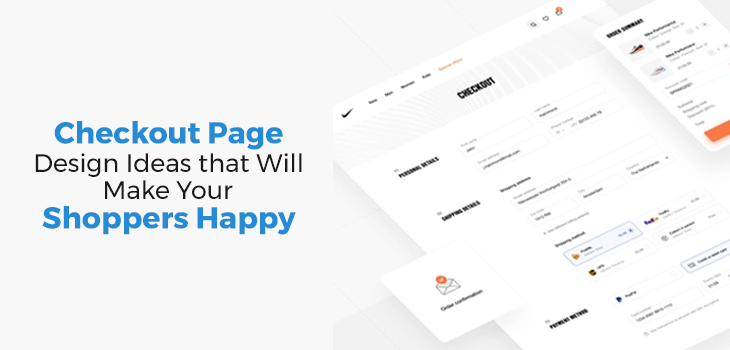
Your checkout page is arguably the important component of your eCommerce store. Enhancing the checkout experience can be instrumental in gaining traction for your online store. It can motivate your customers to purchase or deter them from doing so. With 17+ years of experience providing eCommerce website development services in Delhi, we precisely know how to improve Checkout Page Design to minimize cart abandonment and maximize sales. In this blog, we have shared our best practices for checkout page optimization, exactly what your eCommerce store might need.
In this blog, we have shared our best practices for checkout page optimization, exactly what your eCommerce store might need.
Why Checkout Page is Important for eCommerce Brands
As an eCommerce website designing company, we prioritize minimal cart abandonment. Cart abandonment is a terrifying term for eCommerce business owners, as it is a sign of a brand offering an average shopping experience.
For new businesses who aren’t aware, cart abandonment means when a visitor leaves a website with products still added to the shopping cart. In the eCommerce industry, it is an embarrassment. It is a sign of lost business. That’s why optimizing the checkout page is the best way to hold on to the 60%-70% of the shoppers who desert at checkout.
Checkout Page Design Tips and Best Practices
We optimize Checkout Page Design in two ways: a) Enhance the UX/UI of the website checkout page. b) Use analytics to understand why shoppers abandon the cart and address them proactively.
There are many reasons why customers abandon carts. But here are the ones that impact the checkout the most:
- Forcing Your Customers to Create an Account. It is like a hindrance, particularly when the customer is in a hurry or making a purchase for someone else. Adding a ‘Guest Checkout’ or ‘Sign up with OTP’ feature to the website will offer a smooth checkout experience.
- Not Providing Multiple Payment & Shipping Options. Customers who cannot pay via their preferred payment method easily leave the checkout. Your eCommerce website designing company must offer unique shipping options and various payment methods to increase trust.
- Hiding Charges and Additional Fees: Unexpected fees or charges added to the checkout summary, such as extra shipping costs not previously mentioned on the product page, can make customers reevaluate their decision and change their minds.
- Making the Checkout Process Complicated. Today’s customers hardly have any patience, and an overly long and complicated checkout process, which requires too much input and time, will clearly lead to cart abandonment.
When applied, our strategies and guidelines will create successful and user-experience-rich checkout pages.
However, remember that since there is no one-size-fits-all in eCommerce marketing, hire an eCommerce website development company in Delhi that values customers’ time and effort and serves to modify and tweak the strategies based on research and analytics.

1. Make the Layout Simple yet Attractive
Remove navigation headers and footers menu from the checkout page. Only show shipping and order fulfillment information or ratings and review. Removing unnecessary clutter from the page will make your website appear calm and collected on mobile devices.
To further optimize conversion rate (CRO), include multiple checkout buttons or ‘conversion points’ on your product pages. Make the options visually distinct and appealing by adding multiple colors.
2. Showcase All Security and Order Fulfillment Features
Prominently displaying security badges and trust signals, estimated shipping and delivery dates, and transparent return and exchange information is a smart move in satisfying customers and gaining their trust.
While these features do not affect or enhance the Checkout Design, ensuring safe and transparent order fulfillment will go a long way in your customer retention strategy. It gives customers confidence in placing big orders.
Connect with DI Infotech eCommerce Development Company in Delhi to add security features to your Shopify or Magento site.
3. Minimize the Number of Steps to Checkout
The average number of steps to reach the payment portal after clicking the ‘add item to cart’ button should be less than five. Reduce this number further by enabling auto-filling through Google form, guest checkout, and single-click checkout. Having fewer steps will make it easier to follow through the checkout process.
4. Promote Relevant Products (Cross-Sell)
In other words, when your customer adds a product to the shopping cart, suggest other related products that they might be interested in buying. For instance, if a customer adds a smartphone to the cart, the seller may suggest tempered glass or a back cover. This not only increases revenue but also improves customer satisfaction.
However, request your eCommerce website designing company in Delhi to apply this as a side-by-side feature instead of a pop-up notification.
5. Provide Several Payment Options
The more payment options you have, the more customers will complete the checkout process. Start with major payment partners, and expand customer choices as your business grows. If your average product value is above INR2000, providing easy EMI powered by credit card or the current favorite ‘Buy Now, Pay Later through Snapmint or Afterpay’ will further reduce the cart abandonment rate.
6. Show the Customers How Much They’ve Saved After Discount
A great way to keep customers from abandoning the cart during checkout is to display the amount they have saved after applying discounts or coupons. Swiggy App is a solid example of this feature, as it constantly reminds you how much you have saved after adding a coupon or how much you can save with Swiggy One membership.
By doing so, your customers will most likely feel confident in their purchase decision and even be motivated to return for future purchases.
7. Use a Progress Indicator
A Progress Indicator outlines all the steps involved in the checkout process. It also indicates the current stage the customer is at, the number of steps and the estimated time remaining to complete the order.
This simple feature in the Checkout Design can provide valuable assistance to customers, particularly the elderly, who may not be as tech-savvy. This can make it easier for them to follow the process and successfully place orders without any difficulty.
8. Include Product Summary to Cement the Purchase
To ensure the customer doesn’t make any mistakes that lead to a return or exchange, your eCommerce website designing company in Delhi must add a product summary on the checkout page and enable the ‘add or reduce quantity’ feature.
The product(s) summary must include the size, quantity, color, name, variant, and estimated delivery date.
Simple tick boxes will allow consumers to increase or decrease item quantity, remove it, or save it for later use. This will keep them from abandoning the cart or reverting to the main page.
9. Embed a Link to Customer Support for Difficult Areas
Identify common areas where customer support might be required during checkout, such as when uploading images, linking audio, or updating prescriptions. Link these pain points with the knowledge base, call center, YouTube link, FAQs, or a live chat, whichever is suitable.
This will let you address their problem in real-time and keep customers from abandoning their carts.
One Final Tip…
Before publishing your website, test campaigns, measure results, adjust your design, and repeat the process to improve your checkout page experience. Stay in touch with your eCommerce website development company in Delhi, as you’ll need to research, update, and upgrade your website design with the best tools and strategies regularly.
With almost two decades of expertise in end-to-end eCommerce development services in Delhi, DI Infotech Leaders have refined the eCommerce checkout process for different business verticals, making it smooth and easy.
Connect with our graphic designer to have your site audited and get an instant quote for design enhancements.
Read More Blogs


